What you see is what you get. Das klang vielversprechend damals. Offen die Frage, ob wirklich jeder das bekommt, was er in den Bildern sieht. Oder ob Bilder in der Lage sind, jedem individuellen Blickwinkel im Sinn der visualisierten Intention zu entsprechen. Mr.Kevin Rice, Global Head of Design bei Pininfarina, setzt sich mit dieser Problematik auseinander. Dazu ein Statement von ihm. Es steht im Zusammenhang mit dem kürzlich von FOXTRON in Taiwan präsentierten MODEL B, das unter seiner Leitung in Turin entworfen wurde. Er verweist in seinem Text auf einen Beitrag der BBC über Paul Cézanne. Um Kevin’s Text nicht zu unterbrechen, ist der Link hier eingefügt. Ein toller Beitrag!
 TWICE AS NICE / KEVIN RICE
Designing a great and desireable car depends on so many different and often contractictory factors. Engineering, cost targets, production requirements, trends, Brand Identity, not forgetting the many personal opinions and of course, time. It’s like different instruments in an orchestra that somehow need to be encouraged to play together at the right time. If something is out of place or tune, people would notice straight away and so it is with car design. The musical “conductor” could also be the car designer who has to balance all these different things and make it look like it was a natural and frictionless process – as if the masterpiece made itself. The truth (as in music) is that it takes great dicipline and creative patience to make it look desireable.
The key skill a designer must have (apart from having a good idea in the first place) is to be able to take what is in his head and faithfully turn that into a real three dimensional car while at the same time, fulfilling all the other requirements of the project. His key skill to do this is sketching. He must compose a design theme and communicate it correctly to the people making the model. Design tools have totally changed dramatically in the last years and the majority are now digital tools, but as with an orchestra that needs more than one instrument, a designer must be able to master a variety of skills to create a proper “work of art”. “Beauty is in the eye of the beholder” is an English language phrase often used to explain that people have different tastes and like different things. It is basically used to say “I don’t like what you like”. While it is used to describe a difference in personal taste, it also touches on a technical fact that most of us don’t realize. The eye of the beholder actually really does see different things!
A recent article about the painter Cézanne on the BBC website by Matthew Wilson, entitled “The Painter Who Revealed How Our Eyes Really See The World”, explains why “errors” in Cezanne’s later works describe what the eye really sees, better than the traditional approach to painting. His paintings seemed to “morph” or “move” in front of you. Before Cezanne, scientists believed the human eye captured a fixed snap shot of the world like a camera lens does. The first photographs seemed emotionless and didn’t seem to accurately show what people actually saw with their eyes. Cezanne’s paintings however seemed to have a warmth and vitality that other painters did not fully capture. It was almost as if Cezanne’s paintings were not freezing time but moving with time, the longer you looked at his picture.
Scientists now know that the eye is composed of sensitive “cones” concentrated within a very small part of the centre of the retina which record colour. The “rods” around it only see dark and light. But the area of the eye that sees colour is so small that we can only see a small part of the object we are focussing on at any one time. The eye has to make many miniscule “saccades” movements, back and forth and then the brain has to put these “scans” together to make some kind of visual sense of what we are looking at. We are constantly “scanning” and the brain constantly re-evalulating. This takes time, so somehow, Cezanne had appreciated that the eye does not freeze a moment in time, but that we actually “see” the movement of time. Then there is the phenomena that when you focus on something for a little longer, the peripheral vision fades. This “Troxler’s Fading” affects what each individual “sees” as do the emotions. Early photographs and traditional paintaing did not capture the “feelings” people had when they looking at something.To quote Matthew Wilson’s BBC article, “Looking is always durational. There’s no such thing as a present, Cezanne tells us – only a continuous flow between past and future”.
So different people have different emotional and visual experiences when they look at the same thing. The same happens when designers and executives look at sketches for a new car but the car itself does not exist at that moment so you also have to imagine what the sketch could be describing. This is hard enough for professional designers who do it every day, but it puts executives in particular, under great pressure to make the right decisions. This of course, has always been part of the challenges of the car industry and might explain the phrase, “Why doesn’t it look like the sketch”, so often used when management see the first design model.
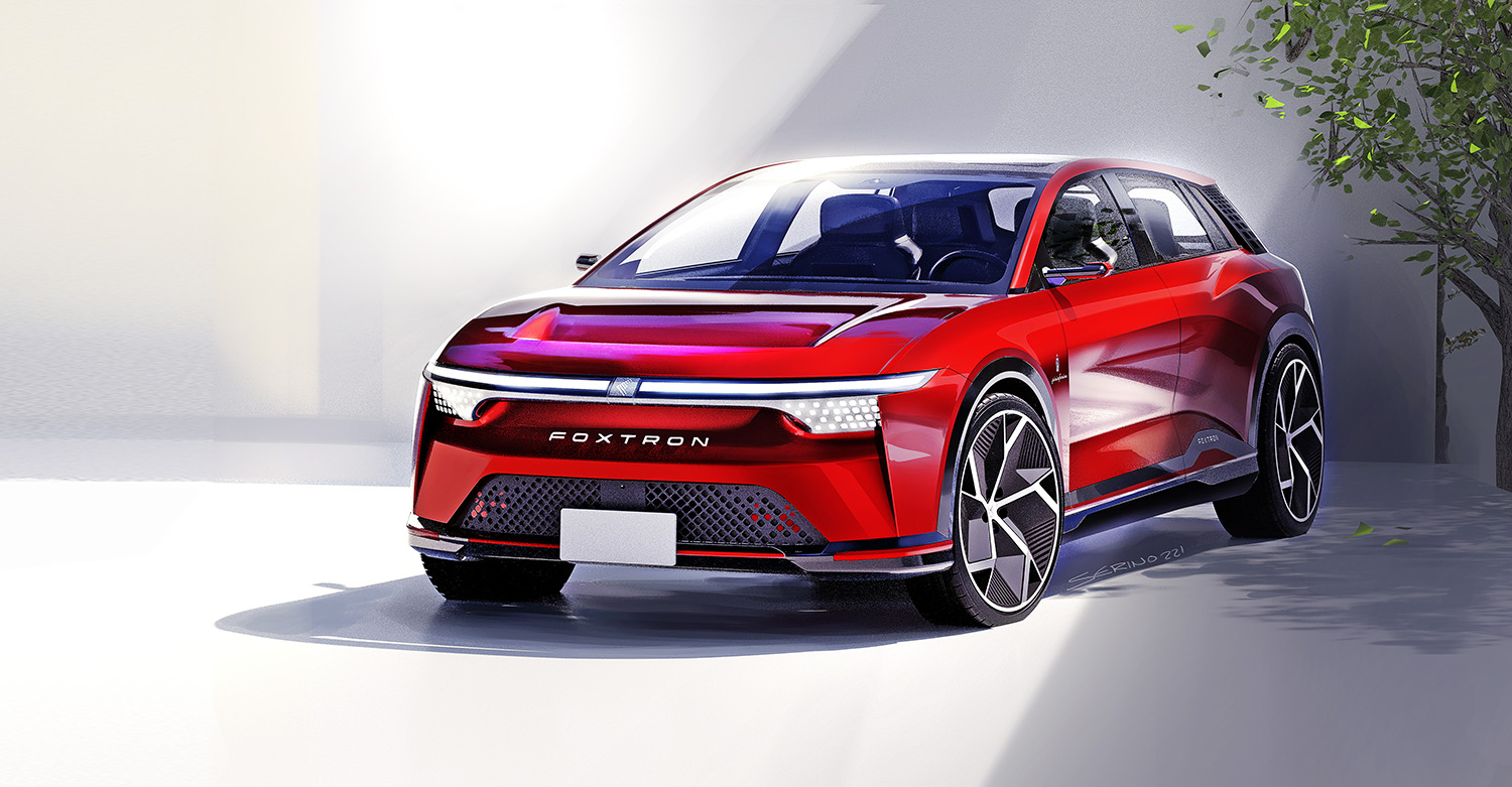
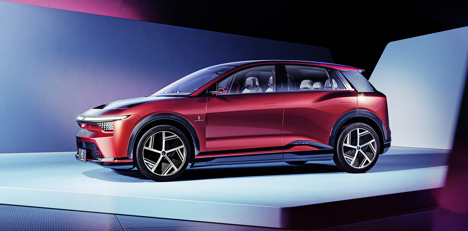
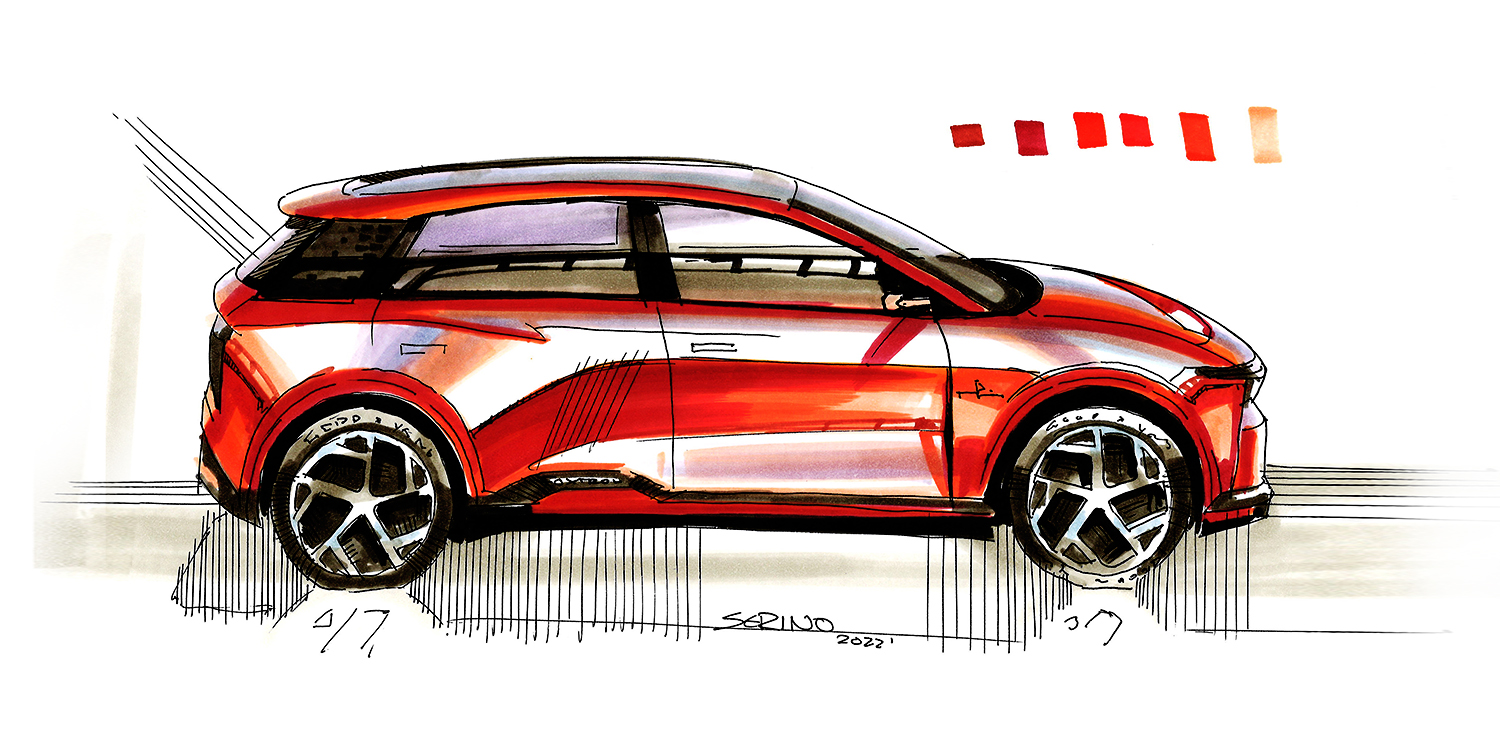
Because time was especially tight on the Foxtron Model B project, it was imperative that no errors were made in the design selection process. So against conventional logic, Pininfarina decided to spend twice as long on sketching than usual! We wanted to make sure that everyone involved in the design process and in particular, the Foxtron executives, were all in love with the SAME car when they reviewed the sketches.
 The Model B is a real car (not an exaggerated concept just for PR), so there could be no room for “misunderstandings”. We skecthed the same car twice in different artistic styles to be absoluitely sure that everyone (including the designer!) all “saw” the same design in the intial sketch phase, the modelling phase and the final build phase.
 Today, sketches are created using a three dimensional virtual model that the designers make and then colour that virtual model to make it look as close to a real car as possible. However, even though realistic looking, these images can look too clinical and lack feeling. The “old fashioned” hand sketches have a soul and a warmth that touch the emotions. The more photographic, digital style confirmed and convinced people that what looked like “art” as a hand sketch was actually also beautiful as a real vehicle, but most importantly, both styles convinced everyone that they were falling in love with the SAME car. This gave everyone the confidence to proceed quickly with building the final model. So the extra time spent in the sketch phase actually allowed us to speed up the rest of the process, It might seem strange to sketch the same car twice, but Cezanne would have insticntively understood!
 Visuals courtesy of PININFARINA

